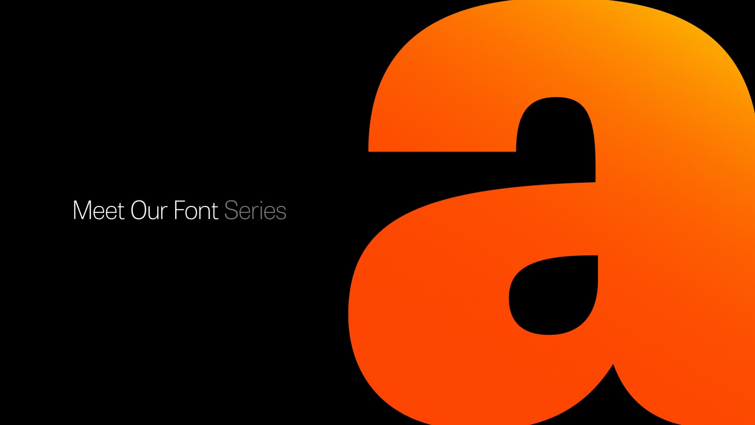
Welcome Fahrenheit Sans, our new brand font!
Please welcome our very own font, Fahrenheit Sans, named in close reference to our brand, Fahrenheit 451°, the temperature at which book paper catches fire and starts to burn.

Share this Article
Just in case you didn’t know, fonts have a life of their own, as we found out. After three decades, we finally decided to craft our own font, which is no easy task (at least not as easy as we initially thought…). We faced numerous challenges along the way. Here’s the full story.
Naming was the easy one, given our brand. 451°, which is the temperature at which book paper catches fire and starts to burn, is also a book by Ray Bradbury. We have our very own CMS named ray (guess why?), so fahrenheit was the next easy choice for the font name.
We believed we could handle the workload and began our search for a typeface that had both presence and personality. So began our long quest for a font that would meet our needs. Developing a clear concept and style proved very difficult, as we needed to consider the intended use, target audience, and overall aesthetics.
Throughout the process, we found many options that were great in one aspect but fell short in others. We particularly struggled with numbers. And since our brand IS a number, it was crucial that the numerals were not great, but exceptional. Ensuring legibility and readability was a major challenge also, as we needed the font to perform well at different sizes and in various contexts.
Unfortunately, most of the fonts we loved had impressive letterforms but lacked suitable numbers. Maintaining visual consistency across all characters was essential, and we had to pay careful attention to kerning and spacing to ensure a cohesive design.
Nevertheless, we pressed on, purchased software, and enrolled in some quick courses to create our very own font and release it, as the deadline for our new website was approaching.
Weeks later, we finally gave up. Creating a full fledged font family is by no means an easy task.
Just by chance, I met someone who knew someone with a type foundry, and thought we should give it a try, so I got in touch with them.
During our initial call I realized how complicated the process was, but on the other hand I had found someone we could talk to, explain what we wanted, and could carry the task of crafting it.
The entire process took significant time and effort, from the initial concept to the challenges of testing and gathering feedback, but it was all part of the journey to bring Fahrenheit Sans to life.
We spent more than 3 months working with TypeTogether twitching the font and mostly, giving it the personality we wanted to show.
So here it is: we present you Fahrenheit Sans and Fahrenheit Sans UI, two families for print and digital, that bring to life our passion for design, for aesthetics, always with a twist…
You will find the font throughout our site and if you ever work with us, in our presentations!
More News
No Results Found
The page you requested could not be found. Try refining your search, or use the navigation above to locate the post.