Time to take care of ourselves
For almost 3 decades we have been servicing our clients with the highest standards, and, usual in this industry, our internal brand work was always left aside to focus on our work for them.

Share this Article
451° has gone through so many changes in 30 years, that we wanted to stop, think about ourselves and work on our very own brand. And that is what we did, rebranding our company, incorporating a fresh look and modernizing our tone.
I’m a tough guy when it comes to branding. Being almost 60, you can imagine my professional life has gone from paper to digital, from CMYK to RGB, from pure Helvetica to the democratization of fonts, layouts, design and so many changes I cannot name them all.
I’m not easy on bright colors, strange fonts, gradients, and so on… so taking on the job of rebranding 451° together with a much younger team was not an easy task for me, and although it has been a challenge, I couldn’t be more happy with the resulting brand.
First, I had to understand the importance of Social Media. Now I realize how the different platforms shape the visual filters by which younger generations see design and value brands.
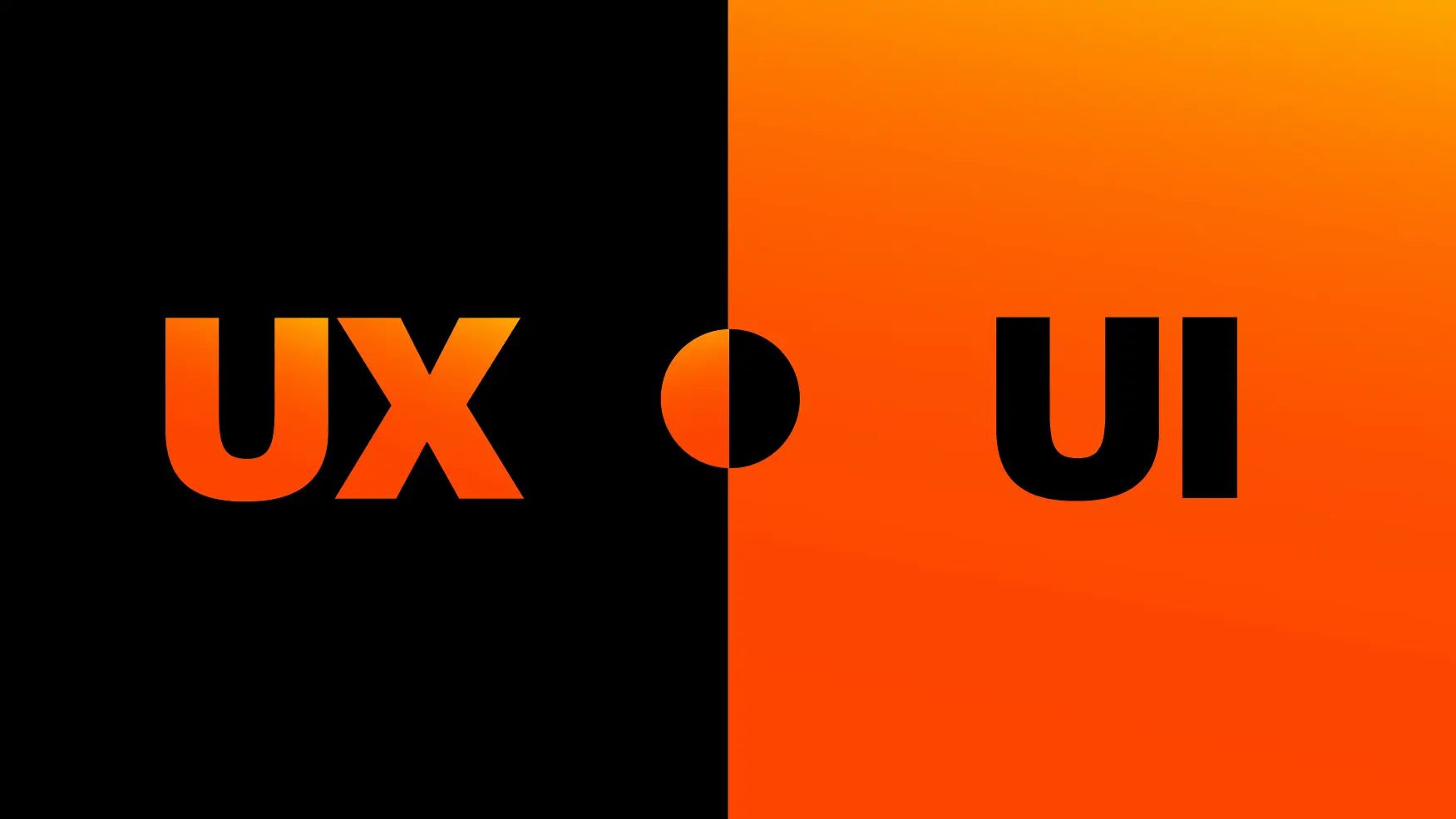
Our design team is built around young, Master-level graphic designers that spent almost 5 years in school learning about our work, about fonts, about UX, UI, so although I know I have much more experience than what they have, they bring a new perspective to me and to our company. And I can say that although I don’t fully agree, they do have a background that supports any argument, so I had to go with that.
We decided to go full gradient. Well, THEY decided, I agreed. Given that we are a digital company, it is expected that our brand book only talks about RGB, not CMYK, and that gradients would not diminish the look of our brand whenever printed in 1 color (remember those times…?). Not any more. Well, almost.
In this blog we will start posting about our new brand in detail. We will all share how we did it, how we incorporated a custom font, how much time we spent thinking about how big the degree symbol had to be and what was the perfect angle for the gradient.
Believe me, it took so many discussions and testing, that the journey has been very long but also very rewarding.
I look forward to sharing with you in our brand new blog every step of our way to what we are, and how we came to be, and maybe, maybe, we can evangelize more “Helvetica” guys into the new trends of design.Time to take care of ourselves
More News
The Creative Director: From Mad Men to AI Madness
I started in advertising at the tail end of the Mad Men era—where creatives had the luxury of time, attention, and full-length TV commercials. Fast forward a few decades, and we’re now navigating an industry where attention spans are shorter than a goldfish’s memory, and ideas must fit within a 10-word post.
The Fluidity of Interactive Design
The landscape of interactive design has undergone a huge transformation in recent years.